YMCA vs. Obesity: Part 3 of 3
Github of code. Let's review. We have collected the number of YMCA locations (YMCA), Food Environment Index (food), % of severe housing problems (housing),% of adults with some college (education), access to exercise (exercise), and the % of adults who are obese (BMI > 30) per county. I explain the data in more detail in part 1 and part 2.
I collected data on a sample (below) of states that have a low, medium, and high obesity rate.
'RI', 'CT', 'MS', 'MD', 'DE','HI','WY','NY', 'NV','NH','ID','UT','SD','MO','MT',
'NM' ,'OH','AZ','OR','AL','ND','LA'
I did not analyze these states separately, the data has been aggregated to give us an idea of the nation as a whole. This is one of many ways to examine this kind of data.
The goal here is to do some linear regression modeling with this data. First, we need to define what our targets are, a.k.a. our 'answers' for the model. Remember that in supervised learning we need to have clear answers or labels. In this case it is obesity (%), because we are trying to understand the contribution each of our features is making to the obesity rate in a particular area.
Features are YMCA locations, food environment index, housing problems, access to exercise, education (some college). As a first look at the data, it makes sense to see how strongly each feature is correlated with the target. Below is graph of this correlation. Notice that education has the strongest correlation, followed by access to exercise and food. Now, this is not the whole story, but it lets us know if a feature is a likely candidate for driving our model.

Test-Train Split (shuffle too)
Next, we split up the data into a training set (I chose to use 80% of the data) and a test set (the remaining 20% of data). If your data is in any kind of order at this point (i.e., sorted by largest number of YMCA locations or even by state), you will need to make sure that the data is shuffled (but keep rows together) so that you don't end up with all one type of data in the test set. Scikit learn has a function that does it for you called 'sklearn.model_selection.Shufflesplit', which makes it very simple to do.
Standardize the data
For regression, we need to make sure our data are all on the same scale. In this case it is not. Some of our columns contain percentages, while others are frequency. We need to subtract the mean and divide by the standard deviation for each column (feature). Again, sklearn makes this simple with the 'StandardScaler' function.
After we do this splitting and standardization, we can plot each feature's (vs. target values) scatter plot with test/train sets in 2 different colors as a sanity check for whether the splitting looks good. If not, maybe you should see if the random seed should be changed, or if there is a bug in the code.
The other nice thing about this plot is that we can see how correlated/uncorrelated each feature is with the targets in much better detail. It is easy to see why the YMCA values weren't all that helpful (clustered around 1, not very many points), and how the food and Education have a pretty clear negative slope. We also see that the split of test (red) and train (blue) looks pretty even throughout each feature. A bad split would have all the red dots clustered in one area on any one graph, rather than spread throughout. And this can absolutely happen even though you chose a random permutation, so don't skip this step.

To visualize the test-train split of each feature, we look at a scatter plot of each feature (X-axis) against the target (Y-axis) and color the data points in the test set red and train set blue.
Regression
It is nice to start with a dummy regressor as your baseline and see if your model can, at the very least, do better than that. A dummy regressor is simply going to always predict the mean value. Below, you can see that the black line is flat, because it's just predicting the mean of the target values (which is zero because we standardized), regardless of what numbers are present in the feature(s).

Next, we will run a linear regression model with 10-fold cross validation. Cross validation is essentially running the regression on 10 different sub-sets of the training data to validate that what we are getting for the prediction is correct. We calculate the mean squared error which tells us how well the line fits the results of actual target values vs. predicted target values.
What we get here is decent prediction. It may not look as good, because I have zoomed in on the data (y =[0, .6]). We measure the goodness of fit (how good the model is) with the Mean Squared Error which is 0.0023. This is good because this value is close to zero (zero is perfect prediction).

Can we do even better with some regularization of our features? The L1 (Lasso) method will take our features and essentially reduces the effect of the ones that don't contribute very much (by driving the coefficients close to zero). This is basically a way to reduce the number of features in the model so that you are left with the ones that have the most influence. When we do this, our Mean Squared Error goes down to 0.0016 (our model got even better).

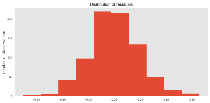
The distribution of the residuals (the difference between each point and our model (the line)) should be randomly, normally distributed; ours are at p=.02 when I ran a test for normal distribution, I also view the histogram of the residuals plotted below.
Now, we need to make sure that our model isn't overfitting. This means that it is predicting the training set so well, that it can't generalize to any new data. That's why we took out 20% of our data when we did that test-train split. Now is the time to bring back that 20% (test set) and run it on our model. We get a Mean Squared Error of 0.001330. Pretty close to zero, again so it is safe to say that the model is not overfitting.

Again, we check to see if our residuals (pure error) are normally distributed. We have a decent spread here with a p=0.000197 even though it looks a little lopsided. It is probably due to the fact that this test set is much smaller, it might be a good idea to go back and put more of the data into the test set and see what we get.
